Cannonball Record
Interesting Depictions of the Data from the Cannonball Record

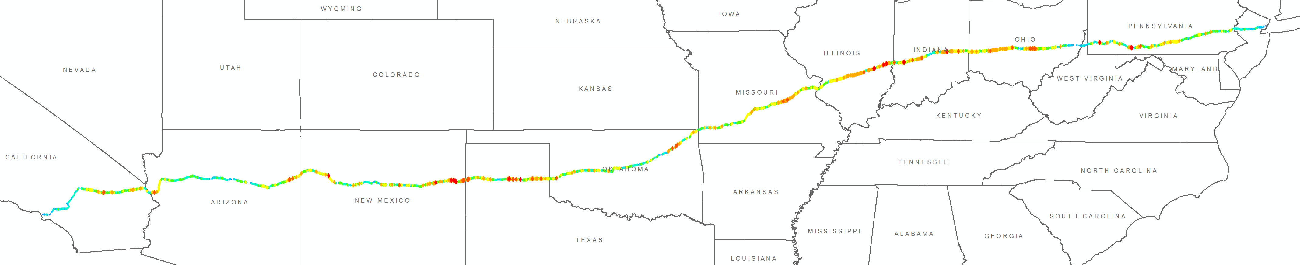
Yesterday I published the data from our record breaking trip across the US here. Doug Demuro from Jalopnik posted an article about the data and the audience immediately started doing some really awesome stuff depicting the data in some really cool ways.
User WhiskeyGolf posted a discussion of his depiction here on the Opposite Lock page.
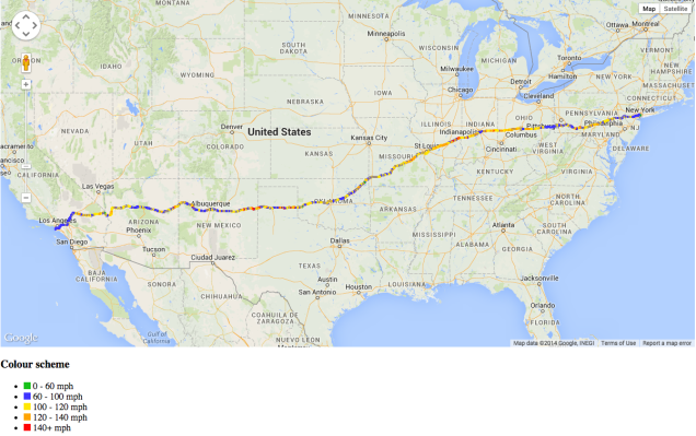

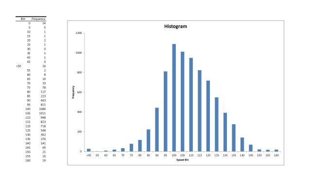
User ChrisMD123 made this awesome 3D representation. The baseline of the US is 100 MPH and each point in red is more than 105 MPH. He also made a great histogram.

User davesaddiction made this:
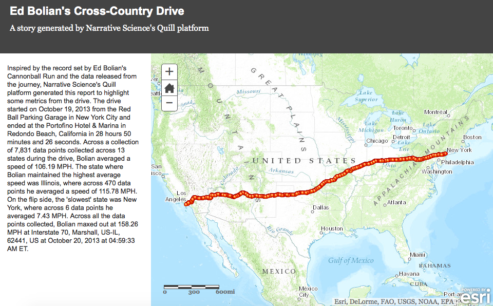
I just got an email from the guys at Narrative Science with this fantastic representation. Click on it and navigate around a bit. Really cool model.

You guy’s have much better skills than I do with this type of thing and I love seeing them. If you create something like this, please email it to me and I will put it up here as well. Thanks!